Web design in 2025 is all about pushing creative boundaries while serving strategic goals. As Webflow’s own research notes, the design world is “buzzing with creativity and innovation” from AI-generated visuals to mind-bending 3D interactions. Modern web design blends cutting-edge technology with bold artistry. This blog dives into the 12 hottest Webflow design trends of 2025, with real examples, implementation tips, and the benefits they bring. Whether you’re a CEO, founder, or entrepreneur, these trends (and our curated portfolio) will help you envision a standout site for your brand.
1. Futuristic, Sci-Fi & Gaming-Inspired UIs
From space-age dashboards to cyberpunk interfaces, designers are borrowing from sci-fi and gaming aesthetics. These sites use neon glows, holographic layers, and 3D elements to feel high-tech and immersive. As Webflow’s research explains, gaming UIs with “glowing edges, holographic elements, and complex motion graphics” are inspiring broader sites. For example, a mockup for a tech startup might show a dark background with electric blue highlights and moving data streams, creating a sense of “being inside” a futuristic system.
Examples
- Film/Game Landing Pages: Many movie or game promo sites (even unofficial mockups) use sci-fi UI; for instance, cyberpunk-themed agency templates.
- Tech Brand Sites: Site sections that resemble control panels or virtual dashboards (e.g., a holographic product showcase).
- Webflow Dashboard Clones: Community demos of Webflow showing “VR lab” layouts with layered cards and neon accents.
Implementation Tips
- Webflow Interactions: Use Webflow’s interactions to animate elements on hover or scroll (e.g., glow on hover, parallax layers). Tools like three.js or Lottie animations can add dynamic 3D.
- Layering & Depth: Stack div blocks with mix-blend modes and box shadows to mimic translucent panels.
- Color & Light: Choose a limited palette of bright neon (blue, purple, green) on dark backgrounds. Use CSS filters (blur, brightness) to create light blooms around elements.
Benefits
Embracing a sci-fi aesthetic instantly signals innovation and excitement. It engages tech-savvy visitors with a futuristic vibe, encourages exploration, and can differentiate brands in crowded markets. This high-energy style also aligns with cutting-edge products (AI, gaming, VR) and can make a site feel like a next-gen app.
2. Window & Shadow Overlays
Another subtle but powerful trend is layered window and shadow overlays. This technique simulates the look of screens, papers, or objects floating above the page, connected by realistic shadows. Originally popular in product mockups, this effect translates to live sites by adding depth and tactile feel. As Webflow’s experts note, designers “meticulously craft shadows that mimic natural light,” making flat designs feel more tangible.
Examples
- Mockup-Style Headers: Hero sections that look like multiple semi-transparent screens stacked with drop shadows (e.g., a “device preview” graphic with layered screen images).
- Card Overlays: Floating panels or “cards” slightly rotated with soft shadows on complex backgrounds.
- Layered Images: Placing an image or video in the foreground with a shadowed overlay of a smartphone or tablet outline behind it.
Implementation Tips
- CSS Box-Shadow: Use a larger blur radius and low opacity to simulate diffused lighting. Adjust opacity and blur to get a soft, realistic falloff.
- Background Overlays: Place semi-transparent white or colored overlay divs atop images/text, with a subtle drop shadow to lift them visually.
- Z-Index Stacking: Stack multiple layers (images, text blocks, gradients) and apply shadows on lower layers so upper layers appear floating. Webflow’s Designer lets you set blend modes and shadows visually or add custom CSS for fine-tuning.
Benefits
Window and shadow overlays make flat designs feel alive and dimensional. They create visual hierarchy (what’s on top versus behind) and guide users’ eyes naturally. This trend also introduces an element of craft: as Corey Moen (Webflow designer) puts it, it revives skeuomorphic touches in a modern way. The result is a sophisticated, approachable site that bridges digital interfaces with the physical world, enhancing user engagement and trust through a more realistic look.
3. Glowing & Neon Light Effects
Designers are increasingly using glowing accents and light blooms to add drama and focus. By imitating OLED screen glow or camera lens flares, these effects highlight key elements and imply energy. According to Webflow, sophisticated glows create “vibrant, almost ethereal experiences” that draw the eye and make interfaces feel responsive. In practice, this can look like neon buttons that softly pulse on hover, or background gradients that glow behind headlines.
Examples
- Glowing Buttons and Links: Buttons with neon outlines or glowing hover states. For example, a button might have a subtle blue glow around it on hover, suggesting interactivity.
- Light Burst Backgrounds: Hero sections with animated light trails or bokeh-like flares behind text, giving an ambient glow.
- Frame Glow: Overlaying a translucent shape (circle, rectangle) with a colored glow behind a photo or card, to highlight it.
Implementation Tips
- Shadow & Filter Tricks: Use box-shadow with color and blur on elements to create an aura. For tighter control, CSS filters (e.g., drop-shadow) or even a glow image layered beneath text can work.
- Lottie and SVG: For animated glows or scanning light effects, use lightweight Lottie files or SVG filters. Webflow can integrate these easily via its Assets panel or <lottie-player> components.
- Contrast & Color: Reserve neon glows for focal points. Contrast (bright glow on dark background) makes them pop. Also, ensure accessibility: overly bright glows should be tempered so text remains readable.
Benefits
Glow effects add polish and emphasis. They naturally draw users’ attention to CTAs or important information, effectively guiding interaction. As Webflow designers explain, glows provide visual feedback, making the interface feel alive and responsive. In short, a well-placed glow makes a design look cutting-edge and lets the brand’s key message or action stand out.
4. Flash-Era Nostalgia & Playful Animations
We are seeing a throwback to early web interactivity, minus the tech headaches of Flash. Designers are deliberately bringing back playful, slightly quirky animations, think custom cursors, hover effects, or even cheeky “Easter eggs” to recapture the fun of the late 90s/00s internet. According to Webflow, modern sites are “recapturing that spirit of creative freedom” from the Flash era.
Examples
- Animated Cursors: Replacing the default pointer with a custom icon or trail (e.g., a sparkling star or company logo cursor).
- Retro Hover Effects: Buttons that animate dramatically on hover (big color changes, confetti bursts, sound effects, etc.).
- Surprise Interactions: Fun elements like Konami code easter eggs, hidden mini-games, or quirky 404 pages (e.g., a pixel art game on 404).
Implementation Tips
- Webflow Interactions: Use Webflow’s interactions to trigger animations on hover or click. For complex behaviours (like code-based cursor effects), custom JavaScript or third-party scripts (e.g., CursorFX libraries) can be embedded.
- Balance & Testing: Flash-era revivals should delight, not distract. Limit the use of heavy animations to key areas, and always ensure core navigation remains clear and accessible.
- On-Brand Playfulness: Tie nostalgia to your brand story. For a retro-themed brand, go full throttle. For a corporate site, use subtler nods (like a fun mouseover only on your logo).
Benefits
When done right, nostalgic touches surprise and delight users, creating a memorable experience that bigger competitors often shy away from. They convey a brand personality that is fun and approachable. In an age of algorithmic feeds and cookie-cutter layouts, these small, humanizing details can “feel like a little high-five from creator to user,” making the site stand out and emotionally engaging visitors.
- Sophisticated Scroll Animations
Scrolling is no longer boring! In 2025, the page scroll becomes a storytelling tool. Elements fade, slide, or transform in sync with scroll position, creating a cinematic flow. Webflow’s research calls scroll-triggered design a “fundamental design language” that can “reveal content, trigger animations, and create multi-layered visual narratives.” This includes parallax effects, sticky elements, and scroll-based transitions.
Examples
- Parallax Backgrounds: Background images or gradients that move at a different speed than the foreground content as you scroll (see popular storytelling sites).
- Revealing Content: Text or images that animate into view when you scroll down. For instance, product images might fade or slide in from the side as they come into frame.
- Progressive Data Viz: Charts or infographics that animate to the right figures step-by-step as the user scrolls, telling a data story in segments.
Implementation Tips
- Webflow Interactions, Scroll Trigger: Webflow’s built-in scroll trigger is powerful; use it to define how and when elements animate. You can chain animations or pin sections.
- Layered Graphics: Break your content into overlapping div blocks. For example, pin a foreground layer while moving the background layer for a depth effect.
- Performance: Keep animations smooth. Limit heavy transforms to key visuals. Always test on mobile, as complex scrolls can impact performance.
Benefits
Animated scroll builds engagement by making users active participants. It can turn passive browsing into an exploration (with your brand as the narrator). According to Webflow, advanced scroll interactions move users “from passive consumption to active exploration,” making content more memorable. In practice, this often means better conversion (users stay longer), clearer storytelling, and a competitive edge for your site.
6. AI-Generated Imagery & Smart Video Content
With AI tools maturing, sites are increasingly using AI-created visuals and strategically planned videos. AI-generated imagery allows for unique art, illustrations, or product renders that would be costly otherwise. Likewise, designers stress “smart video” using purposeful video content instead of random embeds.
Examples
- AI Art Assets: Custom background patterns, illustrations, or hero images generated by tools like Midjourney or DALL·E, tailored to the brand’s style. For instance, a SaaS landing page might feature an AI-created abstract geometry as a hero.
- Interactive Video Players: Embedding polished videos with custom controls or overlays. For example, a startup might use a silent autoplay hero video behind translucent text and include an on-video CTA using a tool like Vidzflow.
- Personalized Graphics: Some sites even use APIs to generate on-the-fly graphics based on user data (e.g., a greeting image with the user’s name created by AI).
Implementation Tips
- AI Image Tools: After generating AI art, import them into Webflow as background images or inline assets. Use them sparsely (overuse can feel generic). Ensure to tweak or combine with real photos for authenticity.
- Responsive Video Setup: Use Webflow’s responsive embeds for videos. Minimalist players (just play/pause) keep focus on your message. For more engagement, embed CTA buttons or forms within videos (Vidzflow lets you do this in Webflow).
- Alt Text & SEO: Describe AI images well in alt text (they may appear “AI-generated”). For videos, provide captions and transcripts for accessibility/SEO.
Benefits
AI visuals and smart video content speed up creation and allow customization at scale. Well-crafted videos and images can dramatically boost conversions and engagement (users prefer video for explanations). By being intentional, one high-quality video over many random clips, and your site feels professional and authoritative. Plus, these dynamic elements can improve SEO (video on your page may rank in Google) and brand recall.
7. Micro-Interactions & Subtle Animations
Tiny animations still pack a punch. Micro-interactions are the small feedback cues (button hover effects, loading spinners, scroll progress bars) that make interfaces feel polished. The trend is to use micro animations with purpose and restraint. For example, a slow color fade on hover or a small bounce when an item is added to the cart. These add delight without overwhelming.
Examples
- Button/Link Hovers: A color shift or shadow that happens when the user’s cursor rests on a button.
- Form Feedback: Input fields that glow or tick icons that animate after valid input.
- Scrolling Cues: A subtle progress indicator on the side of the screen or images that gently animate in as you scroll (not full-blown scroll animations, but simple fades).
Implementation Tips
- Webflow Interactions: Use hover and scroll interactions for these effects. For instance, set an element to move 5px or change color on hover. Even a slight 100ms transition can be engaging.
- SVG and Lottie: For more complex micro-animations (animated icons, spinners), use lightweight SVG or Lottie animations that loop or trigger on user actions.
- Performance First: Because these are everywhere, optimize them. Use CSS transitions when possible (they are hardware-accelerated) and limit the duration brevity keeps them feeling snappy.
Benefits
Micro-interactions guide user behaviour and make your site feel intuitive and alive. They can improve UX significantly: for instance, a tiny animation on form submission reassures the user that something happened. They also convey quality; sites with smooth micro-details feel more refined and trustworthy. As Flowcub notes, these “subtle animations make the interface feel alive and intuitive,” giving a polished, professional vibe.
8. Bold Typography & Minimalist Layouts
2025 favours big, expressive text and clean layouts. Oversized headlines and generous whitespace let your message cut through the noise. In practice, this means a hero with a few words in a custom display font, or a site that uses a simple grid and large type instead of clutter. The key is letting the content breathe.
Examples
- Text-Only Headers: Some landing pages now skip background images entirely and use striking, large-type headlines (often full-width) to grab attention.
- Monochrome & Contrast: A design might use mostly black-and-white with one accent color, and feature a big serif or sans-serif font for headings.
- Minimal Service Pages: A product page with a single product image on one side and a huge, bold description text on the other, with lots of empty space around.
Implementation Tips
- Typography Choice: Use Webflow’s font tools to pick bold, unique fonts (even variable fonts). Larger font sizes in Webflow’s style panel (>4rem for headings on desktop) create impact.
- Whitespace: Avoid overfilling pages. Utilize padding and margins liberally. The rule “more white space” can guide improvements. Webflow makes it easy to adjust spacing visually.
- Layout Grids: Simple layouts (like a 2-column grid) often work best. Do not be afraid of empty sections—they direct focus and improve readability.
Benefits
Big, clear typography conveys confidence and clarity. It aligns with the “less is more” philosophy: by removing clutter, you increase focus on what matters. This boosts message retention and brand perception (you appear modern and bold). Also, SEO perks: clear headings improve scannability and can be optimized with keywords. As Flowcub suggests, pairing strong headlines with minimalist designs “makes brands feel confident and cuts through the noise.
9. Dark Mode & Accessibility-First Design
Dark mode is not going away; in fact, it is becoming an expected option. Offering both dark and light themes caters to user preference and eye comfort. Beyond aesthetics, many trends emphasize accessibility (good contrast, screen-reader compatibility, keyboard navigation). Webflow has built-in tools (like ARIA attributes and focus states) to help with this.
Examples
- Dark/Light Toggle: A switch in the header that lets the user change themes. Many modern sites (especially tech or creative ones) include this.
- High Contrast Text: Ensuring text against backgrounds meets WCAG standards (often automatically achieved by dark or light backgrounds).
- Accessible Forms: Large click targets, proper label tagging, and error messages that visually and textually appear.
Implementation Tips
- Themes in Webflow: You can set up two global color swatches (light and dark palettes) and toggle them using a bit of custom code or interactions. Many Webflow templates now include dark mode out of the box.
- Check Contrast: Use Webflow’s color tools or external checkers to ensure text is readable on both themes.
- Semantic HTML: Use Webflow’s form and text elements correctly (e.g., Header tags, <label>, alt attributes) so that screen readers can parse them. Webflow’s Editor lets you set alt text and headings easily.
Benefits
Accessibility-first and dark mode designs broaden your audience and future-proof your site. Dark mode, in particular, can reduce eye strain and even save battery life on OLED devices. Importantly, accessible sites often rank better in SEO (search engines favour good usability). Overall, a thoughtful, inclusive design means lower bounce rates and higher satisfaction, key for any CEO or founder focused on conversions and compliance.
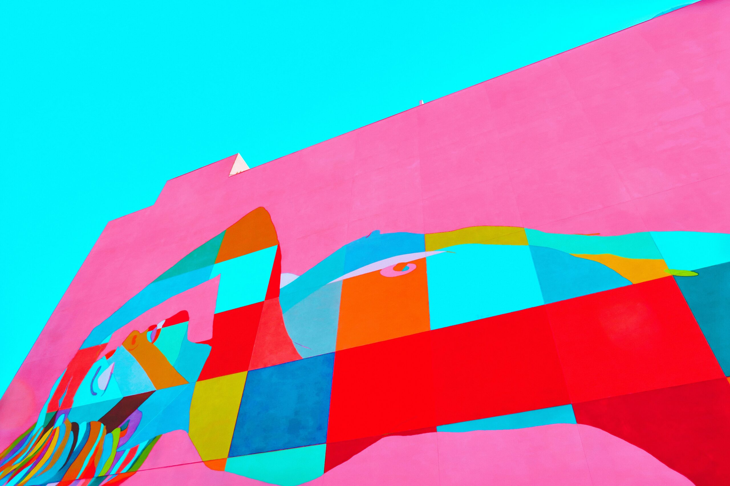
10. Organic Shapes & Authentic Artistry
Moving away from rigid grids, many designs now feature organic, irregular shapes and hand-crafted art. This human touch, often alongside anti-design elements, adds warmth and authenticity. Trend reports note that nature-inspired, asymmetrical forms are big in 2025. In practice, this looks like blob-like graphics behind text, watercolour textures, hand-drawn illustrations, or brush-stroke accents. (See our portfolio, our Born Clothing and Gunpowder projects use splashes of color and fluid shapes for a personalized feel.)
Examples
- Custom Illustrations: Instead of stock photos, many sites commission unique vector or hand-sketched graphics (e.g., abstract shapes that align with brand colors).
- Irregular Layouts: Break the grid, imagine a circle or ellipse cropping a corner of the page, or staggered sections that are not uniform.
- Hand-Drawn Elements: Doodles, brush strokes, or collage-like cutouts as decorative accents on a page.
Implementation Tips
- SVG & PNG Assets: Import custom illustrations (SVG for shapes, PNG for textures) into Webflow and place them using absolute or fixed positioning.
- Clip-Path: CSS clip-path allows you to give images organic edges (like a blob instead of a rectangle) without editing the image itself. Webflow supports custom CSS for this.
- Blend with Animations: To tie to the “imperfect” trend, apply very subtle animations (like a slow “float” or color shift) to these elements to make them dynamic yet natural.
Benefits
These organic, handcrafted visuals make a website feel unique and genuine. They soften the interface, making brands appear approachable and human. As Veza Digital explains, organic shapes “make websites look more natural and interesting” and convey warmth. This approach helps companies stand out from sterile, “template” sites and can strengthen the emotional connection with visitors.
11. AI Chatbots & Personalized Content
Building on AI imagery, AI-driven personalization is a major trend. Smart chatbots are now more intuitive (“chatbuds”), provide 24/7 help, guide purchases, and personalize the journey. Meanwhile, sites curate content per user (e.g., showing products or articles based on location or past behaviour).
Examples
- Conversational Bots: A chatbot pop-up that answers FAQs or offers product demos in real time. For example, e-commerce sites often have bots to handle returns or sizing questions.
- Dynamic Content Blocks: A CMS-powered section that changes its content based on user data. For instance, a homepage might highlight the nearest store or a recently viewed product.
- Personalized Landing Pages: Marketing campaigns send users to pages featuring their name or company (made in Webflow via query string or script).
Implementation Tips
- Add Chatbot Widgets: There are many SaaS chat tools (ManyChat, Tidio, Drift, etc.) that integrate into Webflow via embed code. Choose one that uses AI to learn common questions for better UX.
- CMS & Collections: Leverage Webflow’s CMS to pull different images or text into a template page. Then use simple JavaScript or membership logic to swap in user-specific content.
- Segmentation: Plan content variants for your main audience segments (e.g., industry, region) and use Webflow’s multi-page CMS or conditions to show relevant blocks.
Benefits
Personalization boosts engagement and conversions, customers feel understood and catered to. AI chatbots handle routine inquiries instantly, freeing up your team while still giving visitors a tailored experience. As Veza notes, AI chatbots offer personalized and efficient interactions all day. Ultimately, personalization is about giving every visitor a unique, relevant experience, which is exactly what drives loyalty and sales.
12. Performance-First, Responsive & Sustainable Design
Finally, the trend is performance and responsibility. In 2025, an ultra-slow or bloated site is out of step. Practices like optimizing images, minimizing code, and choosing eco-friendly hosting are on the rise (called Sustainable Web Design). Webflow itself makes this easier—every site is inherently mobile-first and responsive.
Examples
- Fast-Loading Layouts: Templates with minimal dependencies and carefully compressed images (e.g., a one-page site with only essential animations).
- Green Web Hosting: Brands are choosing hosts powered by renewable energy. (Some even calculate the carbon impact of their site.)
- Dark & Light Combined: Offering dark mode also cuts power usage on OLED screens (dark pixels = off pixels), indirectly contributing to sustainability.
Implementation Tips
- Optimize Assets: Use Webflow’s responsive images feature (it auto-generates smaller versions for mobile). Compress images and animations before uploading.
- Clean Code: Keep interactions simple. Avoid unnecessary JS embeds—use native Webflow interactions where possible. Every extra script adds load time.
- Responsiveness Checks: With Webflow’s breakpoints, always preview and tweak layouts for mobile/tablet. According to Blushush’s experience, “Webflow ensures every design is responsive out-of-the-box,” but we recommend testing every element (especially complex scroll or hover effects) on small screens.
Benefits
A fast, responsive site is crucial for user retention and SEO. Google and visitors reward pages that load quickly on any device (in fact, 60% of web traffic is mobile nowadays). From a business perspective, better performance means better SEO rankings and higher conversions. And by minimizing resource use, your site is a more eco-friendly selling point for modern customers and socially conscious leaders. In short, design trends that prioritize performance make sites more enjoyable for users and future-proof them for regulations (like Web Content Accessibility Guidelines) and emerging standards.
Ready to future-proof your website with these trends? Explore how Blushush brings modern Webflow design to life. Check out our portfolio for examples of bold, on-trend sites, and contact us to learn about our trend-driven Webflow services. Let’s make 2025 your brand’s most innovative year yet!